
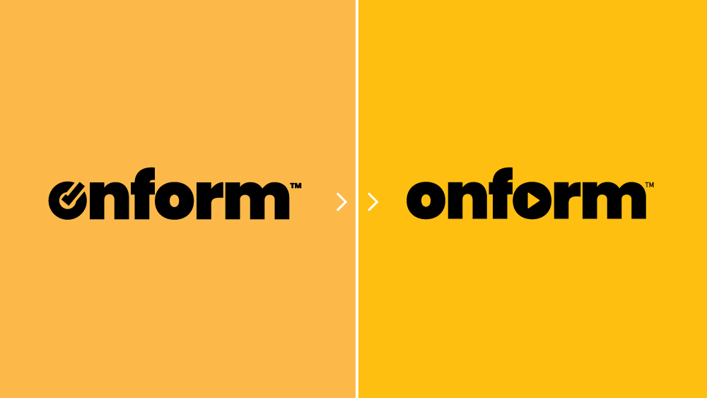
Our brand signature has been altered slightly to better reflect who we are and what we do. We’re a video company, first and foremost and we recently underwent a slight brand refresh to help visually embody that core offering.
Why the new logo?
Over the next few days you’ll start to notice a new logo that incorporates a video play button which is a slight departure from the original logo which embraced a checkmark. This small change is a stronger visual representation of who Onform is at its core: a video coaching platform. Our entire mission is to help coaches reach their athletes’ true potential through video, and we want our brand to reflect that.
What else is changing?
We’ve also given our signature Onform yellow a refresh. The new shade of yellow you’ll see in our marketing materials and throughout the app is brighter and easier to read. It’s a reflection of the positive, energetic vibe associated with our brand promise – helping people achieve their true potential.
What This Means for You
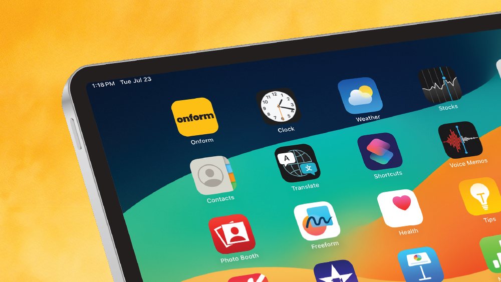
You don’t need to take any action – the update will happen automatically. The new logo will be rolling out across the app store, your Onform app, social media, website, and everywhere else Onform lives. Moving forward you’ll simply look for the revised app icon on your mobile devices and rest assured the same quality video coaching platform is behind it.
We believe this new look better represents the amazing work you do as a coach. It’s a visual reminder of the power of video in improving your athletes’ form, and the role Onform plays in that.
As always, we’re here to answer any questions you might have. Feel free to reach out to our support team if you need anything. Send us an email at support@onform.com or schedule time with us here.